
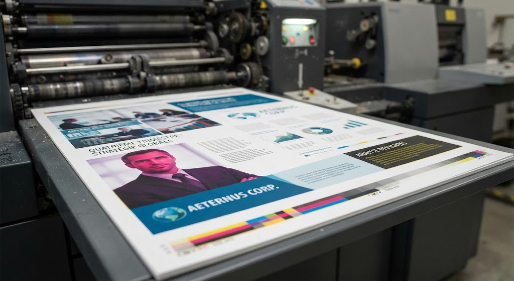
In the realm of professional printing, maintaining consistent color quality is essential for achieving stunning results. However, unexpected color problems often arise, leaving designers and print professionals puzzled. Understanding the underlying causes of these issues can help create effective solutions and ensure that printed materials meet desired specifications.
Diagnosing Sudden Colour Changes in Professional Printing
Sudden colour changes in printed materials can frustrate anyone involved in the printing process, from graphic designers to business owners. Various factors contribute to these unexpected shifts, and identifying the root cause is crucial for rectifying the issue. Let’s explore some common culprits behind such problems.
Utilizing Proper Colour Profiles
One of the primary reasons why colors shift unexpectedly is the use of different color profiles. Each device—whether it’s a monitor or a printer—uses a specific colour profile that dictates how color information is interpreted.
- RGB vs. CMYK: The RGB (Red, Green, Blue) model is used for screens, while CMYK (Cyan, Magenta, Yellow, Black) is used for printing. When converting from RGB to CMYK, some colors may be beyond the printer’s gamut, leading to duller results.
- Calibration Issues: If monitors are not calibrated correctly, colors may appear more vibrant digitally than they do in print. Regular calibration helps ensure that what you see matches what you get.
- Application Conflicts: Using different design applications can lead to inconsistencies if one program assumes a different color space than another. Always ensure the same color profile is used across all platforms.
Examining Media and Material
Another factor that significantly impacts color outcomes is the type of media being used for printing. Different materials absorb and reflect light in various ways, leading to variations in how colors appear.
- Glossy vs. Matte: Glossy media often produces brighter and more saturated colors due to its reflective properties, while matte finishes can appear softer and more muted.
- Paper Type: Uncoated papers might yield less vibrant colors because they absorb more ink than coated types, affecting saturation and brightness.
- Surface Texture: The texture of the media also plays a role. Rough surfaces scatter light differently than smooth surfaces, leading to variations in the perceived color.
Analyzer of Print Settings and Equipment
Print settings and the equipment used are crucial components in achieving consistent and accurate color reproduction. Small adjustments can lead to significant differences in output quality.
Adjusting Printer Settings
Incorrect printer settings can dramatically influence color output. It’s vital to check settings before sending documents to print.
- Media Type: Selecting the correct media type in printer settings ensures the right amount of ink is applied.
- Quality Settings: Higher quality settings can prevent issues related to color density and saturation, while draft modes may compromise print quality.
- Color Management: Ensure that the printer’s color management settings match those of the designing software. Conflicting color management can lead to unexpected shifts.
Regular Maintenance of Printers
Routine maintenance is necessary for consistent color quality. Poor maintenance can lead to uneven ink distribution, clogged nozzles, or worn-out components, all of which can affect color outputs.
- Nozzle Checks: Performing nozzle checks regularly helps identify clogged pathways that may disrupt ink flow.
- Ink Quality: Using fresh, high-quality inks that are compatible with your printer is essential. Expired or unsuitable inks can cause changes in color accuracy.
- Printhead Cleaning: Regular cleaning of printheads ensures that colors are applied evenly and prevents buildup that could alter color fidelity.
Lighting Conditions and Perception
Even after all adjustments, color perception can change based on lighting conditions. Understanding metamerism—where colors look different under varying light sources—is crucial in evaluating prints accurately.
Adapting to Different Lighting Environments
Colors can appear drastically different under different types of light. Here are some considerations:
- Natural vs. Artificial Light: Sunlight will often show colors more accurately compared to artificial lighting, which may cause colors to appear warmer or cooler than intended.
- LED vs. Fluorescent: LED lights can produce a different color temperature compared to fluorescent lights, leading to noticeable color shifts in prints.
- Viewing Angles: Colors can look different depending on the angle from which they are viewed, especially on glossy surfaces that reflect light.
Prevention Strategies for Colour Problems
To maintain color consistency throughout the printing process, implementing effective color management strategies is key. This can minimize unexpected changes and ensure high-quality results across various materials and formats.
Implementing a Consistent Workflow
Establish a consistent workflow that emphasizes color management. This includes:
- Regular Calibration: Frequently calibrate monitors and printers to ensure colors remain consistent across devices.
- Utilizing Color Profiles: Consistently use the same color profiles throughout the design, print, and review process.
- Soft Proofing: Use soft proofing techniques to visualize how colors will appear in print before finalizing the document.
By understanding the nuances of color reproduction in professional printing, individuals and businesses can address common color issues effectively. Adopting a proactive approach helps ensure that the final output meets the desired aesthetic and professional standards across various applications.