
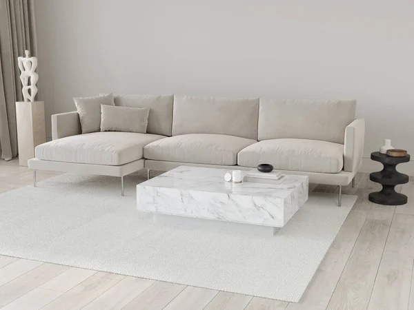
Off-white has become a popular choice in home decor for its ability to create a timeless and elegant atmosphere. However, many homeowners make critical mistakes when using this shade, resulting in spaces that lack harmony or warmth. Understanding how to effectively incorporate off-white can significantly enhance your living environment. This article will explore common decorating blunders with off-white and offer actionable tips to elevate your style.
Understanding Off-White in Design
Off-white, often considered a neutral, provides a soft backdrop that can complement a variety of colors and styles. Unlike pure white, it introduces warmth and subtlety, making it suitable for both modern and traditional interiors. However, mistakes often arise when pairing off-white with mismatched colors or textures. To maximize its potential, it’s essential to recognize how different elements interact with this lovely hue.
Color Combinations to Avoid
When using off-white, certain color pairings can lead to a disjointed look. Below are some colors to be cautious with:
- Bright Colors: Pairing off-white with vivid shades like bright red or electric blue can create jarring contrasts that detract from the soothing nature of the off-white.
- Dark Hues: While deep colors may seem appealing, they can overwhelm an off-white palette, making the room feel claustrophobic.
- Cool Tones: Mixing off-white with excessively cool colors like icy blues can lead to a sterile feel, negating the warmth that off-white provides.
Balancing Patterns and Textures
Another common mistake is failing to balance patterns and textures. Off-white can beautifully unite various elements, but the wrong combinations may undermine this effect.
Using Patterns Wisely
It’s vital to choose patterns that enhance rather than clash with off-white tones. Here’s how to do it:
- Simplicity is Key: Opt for understated patterns that don’t compete with your primary design. Subtle stripes or delicate florals can add character without overwhelming the space.
- Textile Variation: Incorporate different textures like linen, wool, or cotton to create depth. For example, pairing an off-white sofa with a textured off-white throw can add comfort and dimension.
- Limit Bright Patterns: Bright and complex patterns can disrupt the tranquility that off-white offers. Instead, choose one statement patterned piece to serve as a focal point, allowing the off-white to shine.
Strategic Lighting Choices
Lighting can dramatically alter the perception of off-white shades, impacting the overall ambiance of a room. Natural light can beautifully showcase off-white’s warm undertones, while harsh artificial lighting may lead to a cold appearance.
Types of Lighting
To enhance the charm of off-white, consider these lighting options:
- Warm Bulbs: Use soft, warm-toned bulbs to create a welcoming atmosphere. This can soften the starkness often associated with off-white.
- Layered Lighting: Incorporate various light sources, such as table lamps and wall sconces, to add depth to the decor.
- Natural Light Maximization: Keep window treatments minimal to allow ample natural light to cascade in, enhancing the warmth of the off-white palette.
Conclusion
Mastering the use of off-white in decor requires attention to color combinations, patterns, and lighting. By avoiding these common mistakes, you can create harmonious and inviting spaces. Explore and experiment with your off-white decor, considering these insights for a beautifully balanced home.


